Will Dwiggins grew up in a musical family. Daily life included much appreciation for literature, visual arts, history, and craft, but music was a constant presence. Will’s mother was a gifted singer and musician; she often served as principal organist for her church, and was equally talented as a pianist. For a time she was a featured singer in Indiana’s Matinee Musicale, a double quartet of women’s voices that performed on tours in the American Midwest. His father played the flute.
During his high school years in Cambridge, Ohio, Will enjoyed being in the school band; as an adult, in Hingham, Massachusetts, he continued his love of music, although in the form of listening rather than performing — most often the compositions of Erik Satie, Francis Poulenc, Claude Debussy, and Maurice Ravel. Given the quirkiness and sprightly energy of Dwiggins’s artwork, it seems exactly right to me that Satie was his favorite composer.
Dwiggins also loved language, and spent his adult life both writing and reading. From high school until the final years of his life, he wrote articles and reviews for newspapers and magazines, and essays about subjects that ranged from technical printing topics to general culture and visual arts. His book Layout in Advertising was published by Harper in 1928, and issued in a second edition in 1946; it continues to be a valued resource for anyone engaged in the act of combining words and images. One of his short stories was chosen for inclusion in Houghton Mifflin’s Best Short Stories of 1915, and he continued to work in this genre, beyond what he created for Athalinthia; Knopf published a collection of his short stories called Paraphs in 1928. After he began working with marionettes in the early 1930s, Dwiggins wrote four complete stage plays with casts ranging from three and four characters to seventeen and twenty-two! In his leisure time he enjoyed history and science books most often. He also adored reading aloud, everything from The Omnibus of Crime to Winnie-the-Pooh.
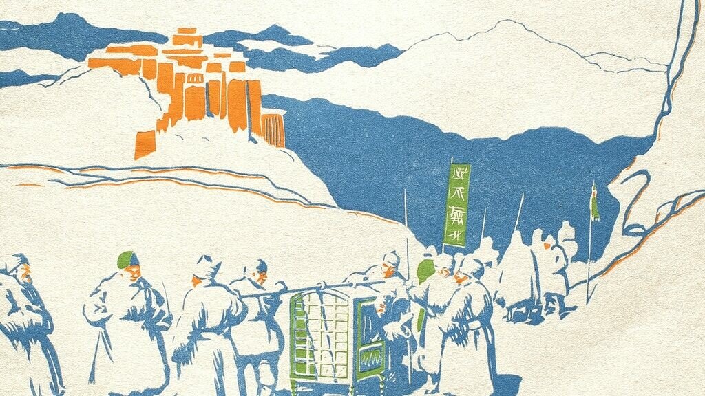
Writing the Athalinthia stories gave Dwiggins a unique opportunity to be something of a composer in his own right. What were all the places to be called in these tales? Towns, mountain ranges, oceans, rivers. And what names would people have? How would they sound, and how would this further evoke the feeling of faraway and exotic places? He delighted in this process of invention, and gave a lot of time and reflection to his choices. In addition to what you will encounter in the printed stories, I wanted to share with you in this update, a sampling of his efforts to choose exactly the right names. The sheets of paper shown below are from the Athalinthia files of the W. A. Dwiggins Collection at the Boston Public Library. They show clearly how willing he was to lavish extensive time to get things just right — as he did on so many of his artistic pursuits.
(I apologize for the image quality — they are snapshots I made in the reading room of the rare book department, where I had no control over the lighting.)
Just as he did in his own time, I encourage you to read these names aloud, so that you can hear them as well as see them on the page.
Finally, I’d like to show you a delightful morsel from 1952. This has nothing to do with Athalinthia, but it’s another WAD creation tied to music. Dwiggins cut the four woodblocks for this Petrouchka image in 1921, but never printed them. Decades later his assistant, Dorothy Abbe, suggested that they issue this broadside as a part of their Püterschein-Hingham publishing efforts. Dwiggins then “typeset” all the music notation himself, by cutting and combining celluloid stencils to make that complex series of notes and staves. His final paste-up (see detail below) was then made into a photo-engraving so that Abbe could print it alongside the four-color woodblock image.
Stochastic?!
over 3 years ago
– Fri, Oct 14, 2022 at 07:57:32 AM
For most of you, “printed with stochastic screens” is a mysterious and arcane term. In this update I’ll explain why I have chosen this exacting path for the printing of our book.
Stochastic screening at left, compared with conventional printing at right. (Image found on-line in a stamp-collecting chat group.)
The usual way to print “full color” (shown at right in the image above) is to build a picture with four passes of transparent ink, using four sets of halftone screens. These are called halftones because their patterns of dots enable the expression of tones that are partway between white (no ink at all, just unprinted paper) and full dark (solid ink, either black or some other color, laid down with no paper showing at all). Remember, ink can only be itself — all dark, or not there at all — so on its own it is incapable of expressing values in between white and full dark.
The halftone screens consist of ordered patterns of dots. You have probably noticed these dots in newspaper pictures, since newsprint paper requires a more coarse pattern that is visible to the naked eye. These dots are set up on a grid, so they form a fixed pattern like the holes in a pegboard. To reproduce dark areas, big fat dots aligned on that grid actually overlap one another. For the lightest areas, there are tiny dots with lots of white space between them.
Various-sized dots of the four transparent inks combine to make a full-color image (lower left)
This example from Atlas Screen Supply shows the four individual color halftones along the top. Each of these is printed onto the paper via a separate ink unit on the four-color offset press. The resulting combination is shown lower left. The dots and transparent inks do a pretty good job, don’t they?!
The enlargement at lower right shows you the dots themselves. Where you see green dots, that’s actually transparent cyan (blue) dots on top of yellow, their hues combining to create the green you perceive. Similarly, the dots of scarlet color are actually transparent magenta dots, with some yellow coming through the magenta ink; when you back away from the picture, the scarlet dots and surrounding yellow merge to present the illusion of the butterfly’s orange wing color.
These CMYK dots work well for the general printing of color images, as long as you do not need fine detail. These days, most color images are printed with screens that are made on a grid of 150 or 200 dots per inch. A few printing companies will use 300-line screens, but that is more demanding of precision, cleanliness, and careful attention during printing, especially in the darker portions of the image — the shadows and three-quarter tones — where detail and image contrast can be lost if the screen is too fine.
If you wish to preserve fine detail in an image, how do you get around this? Well, that’s where stochastic screening comes in. Here’s an example from Czech printer Hi-Fi Tisk:
If you back up from your screen and squint, you’ll see that the images are similar, but what a difference at close range!
Stochastic screening employs random clusters of extremely tiny dots. All dots are the same size, so if there is a dark area, many dots are piled up on top of one another. Stochastic process demands a lot of the printer — the shop must be maintained like a NASA clean room, and continuous vigilance is required on the part of the press crew. However, stochastic also brings two big rewards: • fine detail that is impossible to capture with conventional screens
• an increased vividness and gamut in the color laid down
Add to this the performance qualities of Penmor’s Komori press: it uses special UV inks that dry much faster and leave more color on the surface of printed sheet, rather than the ink soaking down into the structure of the paper. This is especially important on the Mohawk Superfine and Finch Fine used in our book, which are high-quality uncoated sheets.
Coated papers are made with kaolin clay mixed into the paper fibers. They are the typical (often glossy) sheet used in most photo and art books. The clay helps to keep the ink sitting up on the top surface of the sheet, rather than the ink soaking down into the physical structure of the paper. As a result, colors are more contrasty and vivid. However, the “hand” or feeling of the paper as you hold the book, is not so friendly as the feeling of uncoated paper; typeset text is also usually easier to read on uncoated paper.
The trade-off used to be that uncoated paper was lovely for reading text, but color reproduction was muted. Metaphorically, the uncoated paper was like a kitchen sponge that would absorb the ink and thus reduce how much color you would see when light bounced from the top surface of the paper back to your eye. By contrast, reproductions printed on a clay-coated sheet would be brighter and more intense, akin to what you see when you dip a dry rock in water. But again the trade-off: clay-coated papers usually feel more technical and hard, not so soft and inviting to the fingers as uncoated papers.
Penmor’s UV press now gives us the best of both worlds: uncoated paper for the ideal reading surface, but better color reproduction.
One more set of examples about stochastic will help to explain why I have asked Penmor to use this exacting process. (In their case, they use Kodak’s Staccato screening system.) I am grateful for their willingness to do this extra-demanding work — apparently I am one of only a handful of their clients who take advantage of this — but they are happy to do it and proud of their craftsmanship. The following pictures are from W. A. Dwiggins: A Life in Design, my biography of Dwiggins, which Penmor printed in 2017 using the same stochastic screens.
Opened up, the book measures 11 x 18 inches (28 x 46 cm).
In the late 1940s Dwiggins designed a new format for the World Book Encyclopedia, and this is shown in the upper-right corner of the left page. The picture printed in the biography is only 3 x 2 inches (7.5 x 5 cm). With conventional color printing, you would never be able to see fine detail in a such a small picture. Yet here, with stochastic screening, the infinitesimal type on those encyclopedia pages is still readable!
A brass line gauge laid down on the page gives you a sense of the scale of this picture.
All type on the encyclopedia page is readable, and the tonal subtleties in the maps have been preserved.
This is the great gift of stochastic. It is far more challenging to print with this system than it is to print conventionally, but the rewards justify it. Through this effort, you will be able to see the finest details in Dwiggins’s artwork throughout the book, and in the afterword — where smaller pictures were needed, to reduce overall page count in that section — you’ll be able to use a magnifier to see additional detail.
Thanks for reading this.
Schedule notes
over 3 years ago
– Fri, Oct 14, 2022 at 07:24:04 AM
As always, I want to be fully transparent with all of you about what’s happening. We are all in this together.
T-SHIRTS For the few of you who ordered the green-and-blue Athalinthia shirts, those are currently in process at the company in Dwiggins’s home town of Cambridge, Ohio. I don’t have a ship date yet, but will let you know once I have that.
POSTERS These will ship out to US addresses later this month. We are waiting for the mailing tubes to arrive. If you live in the US and ordered both a book and a poster, the poster will come to you via first class mail; the book(s) will ship separately, later on, sent by media mail (which I chose to keep shipping fees lower) in good, stout packaging. Please note that international orders for books will have posters included in the shipping box, so in those cases posters to you will not go out ahead of time. Same with the deluxes — posters will be packed with the deluxe book in a shipping box, unless you added separate postage in your pledge for the poster to be sent separately.
STANDARD Some further discouraging news for the standard edition. Not only has Superior been suffering from a major Covid outbreak . . . now their Smyth sewing machine has broken and needs a part, which must come from Italy. When I have some idea of schedule from them, I'll report on that, but I fear it is looking like December and not November for us to have those books to send out. In these strange times, we just have to flow with what is.
DELUXE Meanwhile, Gray will be working on the deluxes and the first batch of 25 copies should be ready to send in December, as originally planned. As a further nod to Dwiggins (although a hidden one), I asked Michael Babcock to set the author names that will appear on the spine; Michael made those on his Linotype machine, using Dwiggins’s Metrolite type. So when Gray stamps the spine in gold foil, those names will be made directly from Linotype slugs cast in WAD’s own type, made in the technology for which Metro was originally intended. And of course the central portion of the spine is all WAD’s hand-lettering.
SHIPPING/ADDRESSES/CHARGES/DETAILS Please remember that I am one person, trying to juggle the myriad details of this project. My home turf is book design and calligraphy, not Excel and CSV spreadsheets. If you find that something is amiss with your order, please be in touch and I'll do what I can to remedy it. Thanks for your patience and understanding.
More on press run (long!)
over 3 years ago
– Fri, Oct 07, 2022 at 06:17:05 PM
I have some more photos from Monday’s press run that I’d like to share with you.
For those of who who are not familiar with the offset printing process, I also thought I might explain a bit about it.
(Inky friends, now could be the time for you to go back to washing up your presses, distributing type, or kerning character pairs.)
First of all, here is most of Penmor’s immense Komori Lithrone press.
Lithrone press with two sets of four printing units.
Seeing Jamie (press operator) and Zack (feeder) standing at the feed end of the press (way over to the right) will give you a sense of the scale of this machine. It sits in a large space that can accommodate all manner of paper stored on the floor, ready for printing, and thus already conditioned to the ideal temperature and humidity by the time it is fed into the press. (Oh, and there's another press of the same general size, sitting on the plant floor behind me!)
The press has two sets of four towers. To print in “full color” you have to lay down four colors of transparent ink — cyan (blue), magenta (red), yellow, and black — onto the paper. These inks combine (imperfectly!) to simulate all colors. Although this process works fine for general purposes, many colors, including some of the gouache paints that Dwiggins loved to use, are “out of gamut” and cannot be reproduced by this C+M+Y+K process. However, using individual colors (a.k.a. spot colors) means dedicating a cylinder unit to each spot color needed, so that path leads to major expense. Printing our whole book in just CMYK meant some compromises, but it also kept the price far lower than if we had added spot colors — to do the whole book’s worth of illustrations there would have been dozens of spot colors!
Why is this printing called lithography? In traditional lithography (think posters from the Toulouse-Lautrec era), an artist draws an image on a large slab of limestone. (Note: lithos is the classical Greek word for stone.) The litho stone has a specially-processed surface, perfectly flat and smooth, but with super-fine microscopic toothy grain (think maybe 1000-grit sandpaper). The artist uses a greasy material to draw lines and shapes on the top surface. When water is applied to the surface of the stone, the greasy substance rejects it but the rest of the stone is happy to retain a bloom of moisture all over its surface. Following this, when an inked roller (like a paint roller, but with a smooth rubber surface) is run across the surface, the oil-based ink sticks to those non-wet, greasy areas, but the ink will not come off the roller wherever there is plain wet stone. (Remember the old adage, oil and water do not mix.) A sheet of blank paper is put on top of the inked stone, then that sandwich is run under a roller that applies pressure, and as the paper and stone travel under the roller, the ink transfers to the surface of the paper. Note that the artist makes a drawing that is backwards, and if there is any text on the print, that must be drawn backwards, also.
Why is this called offset lithography? The traditional process used by artists since the 1790s could be called direct lithography, as opposed to offset. In our modern production printing, there is an extra step of transfer whenever an image is printed. Each of the eight towers on this press has an inking system at the top. Below this is an array of three cylinders that all rotate and touch at their points of tangency. Highest up is a cylinder with a thin metal plate wrapped around it; that plate contains the image to be printed: type, lines, and the dots that make up part of a picture. In the middle is a second cylinder that rotates in the opposite direction, tangent to the first one, with a rubber sheet wrapped around it (called a blanket). Below that is the third cylinder, which rotates tangent to the second one.
First the cylinder at the top (with the metal plate on it) receives ink from the fountain at the top. It then rotates so that its inked surface comes into contact with the rubber blanket on the middle cylinder, and thus the inked information from the metal plate offsets onto the surface of the rubber blanket. That middle cylinder now rotates (the rubber surface carrying the ink) and makes contact with the surface of the third cylinder (called the impression cylinder). However, a sheet of blank paper has been introduced into the mix here: it travels between the rubber cylinder and the impression cylinder. As the second and third cylinders rotate and meet at their point of tangency, the paper scoots between them, and ink now transfers from the rubber surface to the paper surface.
Part of a 32-page press sheet. You can see the color separation proofs off to the side, which we compare to the images on the printed sheet as we are running the job.
Penmor’s press takes sheets of paper up to 40 inches (102 cm) wide. The sheets we are running are 25 x 38 inches (64 x 97 cm). Each sheet going through the press has 32 pages on it (16 pages on each side of the sheet). The Athalinthia book is 256 pages in all, so to make a complete book, we print 8 of these big sheets (in printer’s jargon, 8:32s) and then cut them in half. Each half-sheet now has 16 pages and those fold down into 16-page units called signatures, so that the book is sewn together as 16:16s.
Jamie at the delivery end of the press, making adjustments to the densities of the four colors of ink on both sides of the sheet. This requires a lot of fiddling to get it right, and then vigilance to be sure things stay that way.
It’s amazing how much things have changed over the decades I have been making books. Jamie has pinpoint control over ink levels everywhere. This is a far cry from the olden times when we would print full-color jobs via what was called dry trap, laying down one or two of the CMYK colors at a time, on a one-color or two-color press, and hoping humidity and other pressroom conditions would not change the dimensions of the paper! (Paper is hygroscopic and can change size slightly when moisture increases, whereas the metal plate used to deliver the image always remain the same size. So getting good fit with the four colors was often problematic: the image dots laid down in subsequent runs through the press might not fall in the same exact places as the dots that had been printed in the first run.)
Okay, more another day. I hope this was edifying for at least one or two of you in our little Athalinthia community. Thanks for reading.
Ink on paper!
over 3 years ago
– Thu, Oct 06, 2022 at 05:43:19 AM
All:
Our turn in the queue arrived, so we printed the book yesterday. It looks wonderful. Sylvia and I got back very late last night and I've had a ton of things to do outside today so I'll post some more pictures in a day or so. But here's the first sheet off the press, with poster, endpapers, decorated cover papers for the deluxe, and wraparound cover for the standard. This (and all the interior) was printed on Penmor’s best press, a 40-inch Komori Lithrone that uses UV inks. And they are willing to put up with the extra fussiness of stochastic screens — in their case, Kodak’s Staccato system — which yields such fine detail. And the vivid color that the quick-drying UV ink delivers on uncoated paper is the bee’s knees.
More soon.
Bruce
Jeff, Steve, Jamie, and Zack with the first sheet of the run. We printed the entire book yesterday. A long day, but it was super to have Jamie there running the press on every fomr for the most consistent results.