New W. A. Dwiggins book! Athalinthia stories and pictures
Created by Bruce Kennett
The personal side of Dwiggins. Cool stories, published together for the first time. Tons of never-before-seen art, much in color.
Latest Updates from Our Project:
Prototype deluxe in hand
over 3 years ago
– Thu, Nov 03, 2022 at 05:27:26 PM
Greetings One and All,
Gray just sent me the prototype of the deluxe and it is every bit as beautiful as I knew it would be. I feel the quiet presence of his craftsmanship and skill in every small detail. Such an honor to work with an artisan of this skill.
I'll put pictures below. A note for deluxe backers: I had written at the outset that Gray and I would sign the deluxes, but he let me know a while back that he *never* signs books. His standard practice is to place his wee and discreet binder’s label near the gutter on the rear endpapers, so that’s what we’ll do with this edition, too.
It looks as if we’ll have bound copies of the standard edition arriving at Penmor around the middle of the month, so we’ll be mailing out out as soon as we can. First batch of 25 deluxes still on schedule for December mailing, too. Those of you who ordered both a deluxe and a standard will be getting those together in one box, at the time the deluxes mail out.
Thanks again for helping to bring this book into the world.
Here's an overall shot of the deluxe spine and covers. Yummy Nigerian goatskin.
I had Owosso make a laser-engraved brass die for Gray to use in foil-stamping the center artwork. They did a fantastic job and Gray’s stamping is superb (way better than my photo quality). The two author names were set in Metrolite by Michael Babcock on his Linotype machine. He then sent the slugs to Gray to use for direct stamping. What I like about this is that the spine art is 100% authentic Dwiggins: his hand-lettered artwork made for the 1948 Waak cover (re-purposed to go here), and the top and bottom names are made directly from slugs cast in his hot-metal Metro. (The only non-WAD bit is that I made the double hyphens in the main title.).)
And here's a peek at the endpapers. Dwiggins had a major interest in Sinbad. During the mid-1920s he issued a series of prints through the fictional Society of Calligraphers that depicted various scenes from Sinbad’s voyages. (Several of these are reproduced in the Athalinthia book.) What you see on the endpapers is the mural that Dwiggins painted for the dining room wall in their house in Hingham. His idea of what Sinbad’s home port would look like. I was utterly charmed when I went to use this for the endpapers, worried about how I might have to crop it, and the aspect ratio of the mural was almost exactly that of the endpapers! For fifty years, this mural has been on display at the Boston Public Library, mounted on the wall of one of the three rooms devoted to exhibiting all things Dwiggins. Sadly, in their recent renovation of the special collections area, the BPL management decided that Dwiggins was not that important, so they eliminated those three rooms. I’m very disappointed about this development, but at least the image gets to appear here, in our book.
T-shirts on their way to recipients
over 3 years ago
– Thu, Nov 03, 2022 at 11:23:52 AM
Hello All,
Jim Jackson, the screen printer in Dwiggins’s home town of Cambridge, Ohio, has finished the run of T-shirts. He mailed them out yesterday, so those of you who ordered them should see your packages at the end of this week, or beginning of next week latest.
The mixing station, where Jim worked carefully to get both colors just right.
One of the finished shirts.
Notes on Page Layout (Part II)
over 3 years ago
– Sat, Oct 29, 2022 at 11:08:59 PM
Given the wide range of format styles In WAD’s own productions, how should I reconcile those while keeping the new production “his” in spirit as much as possible? My design responsibility was to set up pages that reflected this spirit, but with Caledonia as the typeface through the full production. (For those unfamiliar with Dwiggins’s Caledonia type, he based this 1939 design for Linotype on the family of types generally known as Scotch Roman, which includes the Bulmer types he admired so much.) In addition, I needed to include running heads to identify the eleven different stories in the book and provide navigational cues for the reader. Finally, I wanted to make it easy to add as many illustrations as I could manage from the major trove I had discovered in the files of the Dwiggins Collection, and to do so in various sizes and in varying locations on the pages.
Here is a new spread that I typeset, following Dwiggins’s 1928 design, but now composed in 11-point Caledonia on 13-point linespacing. This copies the layout he planned for composition in Bulmer type. The type page feels very dense to me, and a bit challenging to read.
This is somewhat better: still 11 Caledonia but linespacing has been increased to 14-point, providing a bit more air between the lines. Note that there is a spatial problem at the head of the page: when the story title is placed between the centered folio (page number) and the gutter margin, it feels very cramped. Fine for “Syrillion” but not so good for “The Drums of Kalkapan.”
Next, I explored Dwiggins’s ideas from late 1943:
WAD’s Athalinthia layout from 1943. Again, very generous margins. He calls for the text to be set in his Electra type (released by Linotype in 1935), in 12-point body on 13-point linespacing, with the result that there is very little space between the lines. There are folios on both pages, and the running heads are now set in small caps; looks fine for [PROLOGUE but will cause a problem for something like [JADE CARVED FLAMEWISE.
My execution of WAD’s 1943 specs, but using 11 Caledonia in place of 12 Electra. The typeset matter still feels very dense. The centered folios up top are fine, but there’s the same problem with the story title being placed between the folio and the inner edge of the text block.
Following the progression of Dwiggins’s own publication designs, I next made a trial setup that imitated WAD’s 1948 Waak layout, substituting Caledonia for the foundry Bulmer that had been set and printed by Abbe.
WAD’s “Waak” layout, replacing Bulmer with Caledonia. This looks nice, with good space for illustrations, but the type feels smallish. Running heads up at the top work well.
Next, I retained WAD’s “Waak” layout in all other respects, but increased the size of the type to 10.5-point on 15-point linespacing. That gives us three fewer lines of typeset matter per page, but the size is more comfortable for reading and feels like the appropriate scale for this page size.
And finally, my emulation of the 1950 Glistening Hill pages.
This is the “Glistening” format with 12 Caledonia in the place of the 12 Winchester English. The type feels quite big for such a small page; also, larger type would force the book to go to more pages, which would in turn make it more expensive for the backers. The folios/page numbers set in the side margins will cause complications as I insert illustrations.
Retaining the margins of the “Glistening” layout, I reduced the body size of the Caledonia to 10.5-point on 15-point linespacing. This feels in better balance with the page size. I’m not liking the running heads up top, though. Dwiggins’s format design for this book did not have heads at all, so he needed little space at the top. However, the new book must have running heads. The one I have added here is an echo of a treatment WAD used elsewhere, but it feels way too cramped. Using running feet at the bottom of the page (where there is space galore) feels like too much of a departure from what he generally liked to do, so that’s not an option.
Considering all of the foregoing, what qualities from WAD’s designs could I incorporate to reach my goals? The body size of 10.5 seems good, and setting the type on a 15-point linespacing gives enough lightness of color to the page, while still remaining fairly economical. (I really wanted to keep production costs down as much as I could.) Wide margins are in order, since that reflects WAD’s own design preferences, and that gives plenty of room and placement flexibility for illustrations. In a book with eleven stories, the running heads provide clear navigation, and I like WAD’s choice in Waak to have a folio on one side, and the story title on the other. Here’s my final scheme:
This is the page layout you’ll see when your copy of the book arrives.
I reached this decision back in late fall of 2021, and then spent the spring and summer months fleshing out the full book with eleven stories, my afterword, and around 120 illustrations. I can report that this format was a pleasure to work with, and it feels as if it is a solid continuation of what WAD designed earlier.
(Note: I did not consider the formats for A Children’s Sampler and the “Scheme for a book” proposal because those did not use the 5-3/4” x 7-1/2” trim size favored by Dwiggins and Abbe that I knew I’d be using for the 2023 book.)
Hope this has been illuminating for a few of you.
Notes on Page Layout
over 3 years ago
– Sat, Oct 29, 2022 at 02:42:38 PM
Hello Everyone,
The caravan posters have mailed out in October, as originally planned. The deluxes are on schedule. T-shirts will be printed today or Monday. But for the standard edition — the central item of this Athalinthia project — we need to wait for the bindery to catch up on the backlog of work after their terrible bout with Covid.
Given this period of delay, I thought I would post more background information, rather than simply making updates with delivery information. This update considers first how Dwiggins designed the formats for the Athalinthia stories that he himself brought into print, and second, how the varying appearances of those productions influenced my own decisions in laying out the 2023 edition.
Backers familiar with typography and design matters will know this process, but for those of you who are not so conversant with it, I thought it might be interesting for you to see how I arrived at the decisions that determine page size, type size, margins, and related matters.
Nota bene: The reflections and images in this update are NOT in my published afterword. After WAD’s stories had been given their full allotment of space in the 256 total pages of the new book, only 30 pages were available for the afterword. This limitation did not permit me to go into as much detail as I would have liked. So for any who are interested in reading this update, you’ll see content not found elsewhere.
Dwiggins made the original Athalinthia dummy in 1928 as a sales aid in his (unsuccessful) pitches to publishers to get the whole collection of stories into print. The dummy is held in the W. A. Dwiggins Collection at the Boston Public Library.
For the new book (the two-page spread at left), I followed WAD’s design for the 1928 title page (at right) as closely as I could. I chose an illustration from the 1948 edition of “The War Against Waak” to serve as frontispiece; WAD’s 1928 dummy had no frontispiece
What’s with the name Siriling on the 1928 title page? In the early days, Dwiggins felt the book should be named for the lead story, and back then he was calling that story “Siriling.” He changed the name repeatedly over the next couple of decades — from Siriling to Sirriling, Sirralling, Sirraling, Syrilion, and finally Syrillion. If you look closely at his 1928 title page, you’ll see a pencil notation that indicates he’s already decided to add an R to change the name to Sirriling.
At this time Dwiggins was making decorations and illustrations with stencils, many of them in color, but it appears that he intended this collection of Athalinthia stories to be a straightforward production with text and line drawings printed letterpress in black ink only. This would be the most affordable means of production for the houses that he hoped might publish the book: Alfred Knopf, The Limited Editions Club, Harper, or perhaps W. E. Rudge.
Here’s a spread from the 1928 dummy. Fairly tall type page, which Dwiggins parked immediately below the running heads. Line illustrations.
The typeset text seen on page 184 in the dummy actually dates from 1932: it’s a pasted-on clipping from the WAD-designed edition of Balzac’s Droll Stories, published by the Limited Editions Club and set in Janson. Dwiggins originally called for his Athalinthia book to be set in Bulmer type. This choice is a bit curious because while Bulmer was always a favorite of his, in 1928 it was only available in foundry type — Linotype and Monotype did not release their machine-composition versions of Bulmer until the late 1930s. Setting the book by hand with foundry type would have made it much more expensive to produce than if it could be set on the Linotype.
I’d like to make a quick aside: For backers not familiar with type lingo, setting foundry type by hand requires the compositor to select each letter from the case, one at a time, with thumb and fingertips, and put it into a holder called a composing stick to make up a line of type, as opposed to machine composition (a.k.a. hot-metal typesetting) in which a line is composed by typing it on a Linotype machine’s keyboard and subsequently cast as a metal slug the width of a full line of text.
In this photo, a composing stick loaded with a line of type sits atop a case of type. The line in the stick is a quote from Dwiggins: “Ornament is a music of space.” (Note that the compositor must place the type into the stick upside down and backwards-reading!)
Here is one line of machine-set type, cast as a single slug on a Linotype machine. This method of setting type via machine brought production costs down dramatically, affecting especially newspaper selling prices but also those of books. (Not to bog things down with technical detail, but the other principal means of machine composition — the Monotype system — casts the letters one at a time and then assembles them automatically into a complete line. Traditionally, Monotype was used for setting books, and Linotype for newspapers and books.)
In the upper photo, that drawer full of little compartments — often seen in antique stores — where individual letters are stored is called a case or typecase. The letters themselves are called sorts. If you reach into a compartment in the case and discover that you have used up all your available letters for, let’s say, the character e, how do you feel? Out of sorts. [!!]
Also, in modern times all letters are kept in one combined case, which is usually called a California case. But before that, the sorts were kept in two different cases: minuscules (abcdef) were stored in one case, and majuscules (ABCDEF) were in another. While setting type by hand, the compositor needed most often to reach into the case with minuscules, so this case was positioned close at hand for easy access; the compositor only needed to pluck out capital letters once in a while, so that case was parked in a less convenient location that required a longer reach, usually in a position higher above the work surface. This is why we refer to abcde as lowercase letters, and ABCDE as uppercase letters. End of aside.
As I have mentioned before, my intention in publishing the new book has been to follow WAD’s design practices and preferences whenever possible. But which preferences?! What he set out as a model in 1928 looks quite different from the choices he made in 1935, 1948, and thrice in the early 1950s, when individual stories (or fragments) were published in small editions, most of these with color added.
When he failed in his attempts to get the full Athalinthia collection published, Dwiggins put aside that idea and turned his attention to the maelstrom of other projects on his drawing table. By 1929, not only did he have an abundance of book design and illustration work (as one indication of this success, he was awarded the AIGA Gold Medal in that year), but Mergenthaler Linotype was bringing him on board as a type designer, and he was about to discover the compelling world of marionettes. He had lots going on. However, in the back of his mind he kept alive the notion that his stories might appear in print, perhaps one at a time, even if having them all together was not a possibility.
The first opportunity came from George Macy at the Limited Editions Club, who was preparing a second volume of his graphic-arts publication The Dolphin for 1935. Librarian Philip Hofer was writing a long article about Dwiggins’s work for this book, thus giving a perfect entrée for one of the Athalinthia stories to be included. “The Drums of Kalkapan” was the first Athalinthia story to appear in print, in the form of a small insert bound into the larger volume of TheDolphin. The story was printed in black and red on sixteen pages of translucent mulberry paper; Dwiggins hand-lettered the entire text in the half-uncial style that he would later refine and develop as his Winchester English type design for Linotype (never released commercially).
The “Kalkapan” story was bound into the larger volume of “The Dolphin II” (Limited Editions Club, 1935).
Meanwhile, throughout the 1930s and ’40s WAD was still thinking about Athalinthia:
Title page sketches from 1938 and 1945 indicate Knopf as the potential publisher. (Note changes in spelling of title.)
More title page sketches, these from 1948 and 1949. By now Dwiggins is figuring he will publish them on his own, seemingly one story at a time, although oddly, there’s no mention in these sketches of the Püterschein-Hingham publishing entity that he and Dorothy Abbe (his assistant from 1947–56) had started in 1947.
The War Against Waak was the first of the Athalinthia stories to be published by Dwiggins and Abbe, and the second title issued under their Püterschein-Hingham imprint. This slender hardcover book was printed by Abbe in 1948 on her 8 x 12 Chandler & Price press, with the text composed by hand in Bulmer foundry type.
The 1948 Püterschein-Hingham edition of “Waak” has generous margins, small type, and lots of leading (white space) between the lines. The running heads at the top have a folio (page number) on one side, and story title on the other side.
The trim size of Waak is identical to that of the 1928 book: 5-3/4” wide x 7-1/2” tall (15 x 19 cm). Given that Dwiggins (and later Abbe) employed these dimensions on numerous occasions, I decided to continue that practice for the 2023 book. This was an ideal size for Dorothy’s press, as a 4-page signature opened out would just fit on her press, enabling her to print two pages at a time. This trim size also allowed me to print the full 2023 book in eight 32-page signatures on 25x38 stock. Very efficient use of equipment in both cases.
The next story to appear was The Glistening Hill, published by Püterschein-Hingham in 1950. This time the text was set in Winchester English, a type of Dwiggins’s own design. He used his Kalkapan half-uncial lettering of 1935 as a basis and developed an entire typeface from it, although ultimately Linotype chose not to bring Winchester into production. However, in a gesture of great kindness, Linotype did cast individual sorts of type in 12-point size that Dwiggins and Abbe could use for their own hand composition and letterpress printing. The Glistening Hill was made with the same trim size as the 1928 dummy and Waak. Again, printed and bound by Abbe as a slender hardcover book.
“The Glistening Hill” has generous side and foot margins, but less at the head of the page, and a larger type size. There are no running heads to announce the title of the story — although in a sense, none are needed, since this book contains only the one story. The folios have become a decorative element: they are set in roman numerals and appear on the outer sides of the text block.
Next . . . Back in the 1930s Edna Beilenson (a partner in the Peter Pauper Press) established a collaborative of women who were important in the printing world. The ranks of its accomplished members included Dorothy Abbe, Ann Blumenthal (Spiral Press), Emily Connor (Marchbanks Press), Mabel Dwiggins, Margaret Evans (Overbrook Press), Bertha Goudy (Village Press), Jane Grabhorn, and Suzette Zurcher (Pocahontas Press). They called themselves The Distaff Side and banded together to publish three titles between 1937 and 1950. These books included contributions from each of the members, plus guest artists; the printed signatures from these many sources were then gathered and bound together to form a single volume. Their third book (1950) was called A Children’s Sampler; this included an eight-page fragment of WAD’s “Bronabejjia” story, designed and illustrated by Dwiggins, with printing, hand-composition (once more in Bulmer), and tinting of the illustrations provided by Abbe. In this case the page size of 7-1/4” x 9-3/4” was dictated by The Distaff Side’s format for the whole book.
This layout for The Distaff Side provides extremely large margins, and lots of space between the lines. The running heads list the story name, and folios immediately below the text block are set as widely spaced arabic numerals.
The last of the Athalinthia stories was another “Bronabejjia” fragment published by Dwiggins and Abbe in the form of a proposal, sent to friends of Püterschein-Hingham in 1951 as a “scheme for a book.” This consisted of eight leaves, printed one side only, and stapled together. A very modest — one could say casual — production. This book, which was described as Athalinthia VI, was never produced.
Text in this proposal was hand-set in 14-point Bulmer and printed letterpress by Abbe. As usual, Dwiggins provided the illustrations and decorations, but this time these were reproduced in a new medium with which Abbe had been experimenting: silkscreen printing. You can see on the page below that Abbe used split-fountain technique, combining inks of different colors to reproduce WAD’s design for a tree.
The proposal for “Athalinthia VI” was in horizontal/landscape format, with no running heads and no folios.
That ends the Athalinthia material produced by Dwiggins, from which I sought guidance for my own layout of the 2023 edition. (Remember, I wanted this to be his book, as much as possible, with my own contributions as recessive as I could make them. I’ve always seen myself acting as his agent, across the gulf of time, working to complete what he dreamed of doing in 1928.)
I'm not sure how this update format works, and worry that there may be space limitations, so I'm going to stop this here, and will continue in Part II to show how I reproduced and evaluated Dwiggins’s varying formats to come up with the final design for our new book. See you there!
Posters mail out tomorrow
over 3 years ago
– Thu, Oct 27, 2022 at 07:50:28 AM
Dear Community,
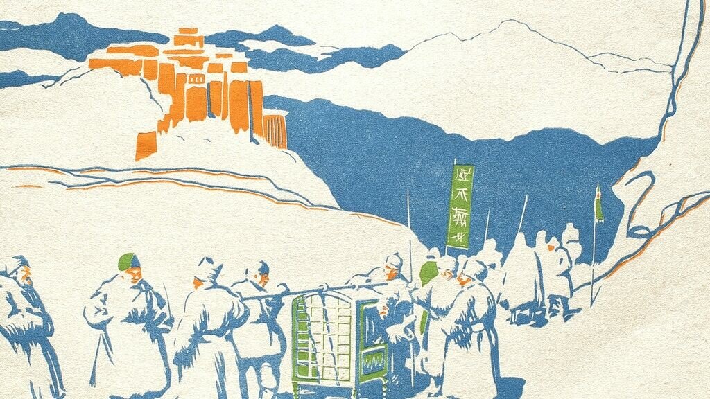
Caravan posters are mailing out tomorrow to all people who ordered them, but only to US addresses. They will ship in a stout tube via first class mail, from Lewiston, Maine, so everyone should have them toward the weekend or early next week.
Backers who live outside the US will receive their posters packed with books. We still do not have a ship date for standard books due to delays at the bindery — I'm hoping late November or early December.
Those who ordered a deluxe (US residents included) will have a poster packed in the box along with the book. Those will ship in December, February, and April, depending on where your book is in the queue.
A handful of you who ordered deluxes added postage for posters, so you will be getting posters in this initial mailing.
My apologies that this turned out to be so complicated. Here I was thinking how nice it would be to give everyone a poster with a book, but the media mail regulations sure put a twist into that!